This was the first question I was tasked with answering during my time at Location3. Users needed a single form to set and manage their company’s budget for individual services provided through the LOCALACT platform for up to 15 months
in advance. Previously, this was a manual process done over the phone and tracked in spreadsheets. The developers had already begun work on the UI when I came aboard and decided on a step wizard type form. I knew that I needed
to catch up quickly in order to make an impact on this project.
Project Goal
Create a new, easy-to-use feature that enables users to set a budget for each service location up to 15 months in advance.
My Role
I led the end-to-end design process and contributed to the front-end development on the final product. I worked with a product manager and a few different developers.
Design
Given few requirements and a tight turnaround, I wanted to start by presenting the simplest solution. Being that this was also intended to be a maintenance tool, where users may only want to edit a single month at a time, it did not
seem logical to put them through a step wizard each time they visit the page. I left that feature out and designed what I assumed would be the minimum viable product — a quick form with two fields that would allow the user
to enter the budget amount and select all months, or a specific month to update.
Once this design was presented to the stakeholders, several new requirements were uncovered and added to the scope. This became a sort of reset moment for this project. We regrouped and decided that the developers would focus
on non-UI elements while I went back to the whiteboard for requirements gathering and new ideas. The developers still wanted to stick with the step wizard concept, mostly due to the work they had already done.
I met with several stakeholders to finalize the requirements and scope. Once those were determined, I made sure that everyone involved was on the same page with a clear understanding of the new requirements.
New Requirements
Include the ability to view and compare all 15 months, like a calendar.
Data for each month to include; month, year, and total budget with calculation breakdown.
All months require an individual input for the budget.
Add the ability to “Pause” any month.
V1: Simple solution to the Monthly Budget Management problem
Initially, I thought we could still default to a simple version of the form for users that did not want to view/edit all 15 months. I wanted to include a toggle button to switch between views. What I did not realize at the time was
that we would eventually be adding data to each month showing the previous year's budget. Basically, this would require users to look at each month to make a decision. The simple form idea became an unnecessary obstacle for users,
so I ditched it.
Whiteboard ideasSimple solution with view toggle
Once I understood the requirements better, I designed what a monthly “card” would look like. I played with different ideas, like having more of a calendar layout with line borders between the months. I knew this would need
to be fully-responsive down to a tablet device size, and found that other layout ideas did not degrade as well on smaller screen sizes. I landed on a standard Material design card with a drop shadow to elevate it from the
page.
UI Design Details
Material Design card with a drop shadow to elevate it off the page.
Font weights to draw the user's eye to the dollar values.
Hidden calculation breakdown for Total Budget behind a hover tooltip to save space and not overwhelm the card with text.
A simple checkbox for the Pause functionality that zeroes the amount and disables the text input.
Single monthly budget card design
V1: Monthly Budget Management design
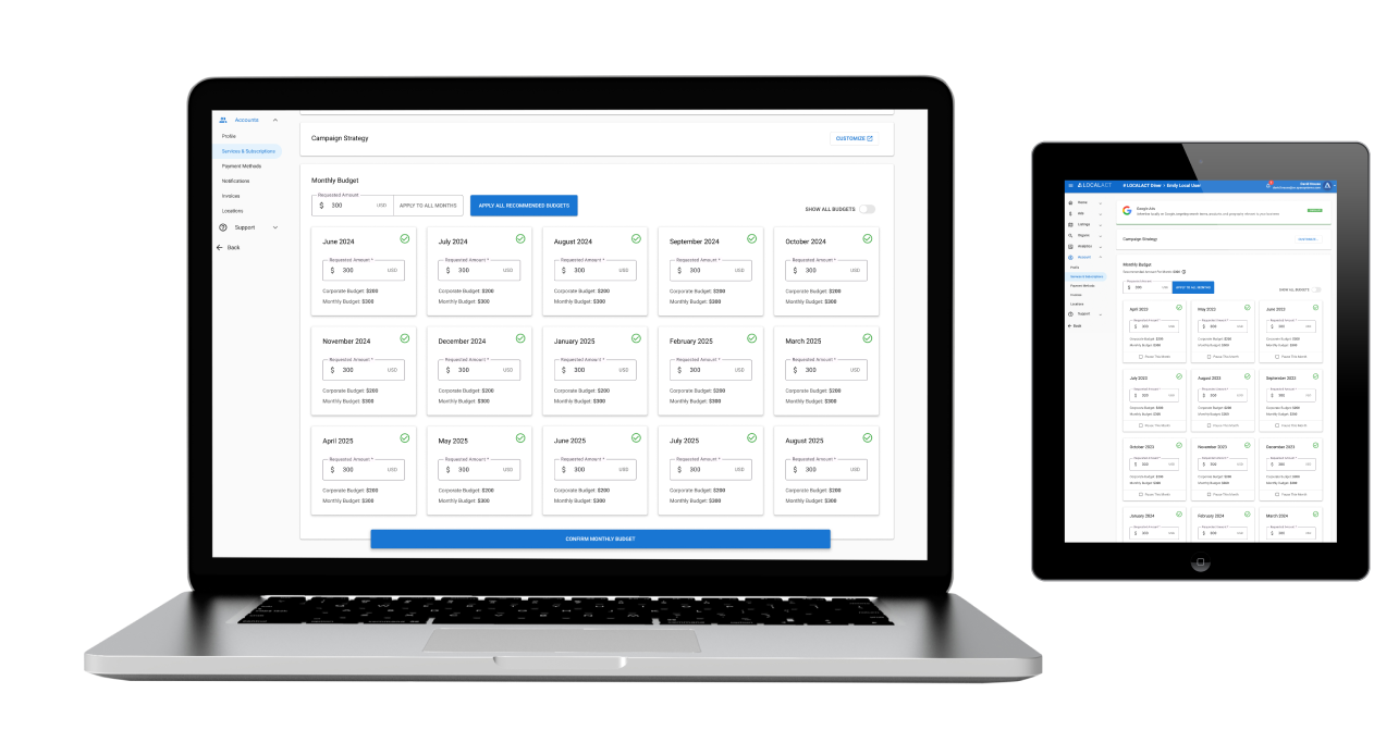
By this point in the project, the team had been restructured and I ended up working with a single developer that agreed the step wizard was not necessary for this feature. I included a filter at the top to view specific months
due to the ever-increasing page length.
After reviewing version 1 of the full page designs with the team, it was determined that the filter would not be as helpful as a single text input that could be applied to all months. I used an icon button as the submit action
for the input with a tooltip to reduce text on the page. This ultimately would be changed to a text button, as some stakeholders didn't understand the functionality. I also included a small caret button in the top right of
the panel to roll it up at any time to see the Payment Method section. Eventually, we decided to move that section above, eliminating the need for the rollup function.
V2: Monthly Budget Management design
Development & QA Contributions
I built the fully-responsive UI foundation in Visual Studio Code with HTML5 and CSS3 in an Angular environment. I then handed it off to the developer who made the page functional. Once that was complete, I helped with QA to get it
across the finish line and ready for deployment.
Design: Phase 2
Before it was deployed to production, the team received new requirements from the stakeholders. This kicked off a new phase of the project.
New Requirements
Each month already had a “status” applied to it behind the scenes. Now it needs to be displayed on the front-end.
Add new Corporate Budget and Monthly Budget lines to each month.
Update the icon submit button to a text button.
Remove the small form submit button and add a large confirm button for the page.
As I began adding new text to the monthly cards, I quickly realized how overwhelming each could be to a user. In order to limit the text in each card, I designed an icon system for the statuses and utilized hover tooltips once
again. The icons could be placed in the empty white space in the top right corner of the card.
Status example: EnrolledStatus example: Unenrolled
Monthly Budget Status icon system
Next, I focused on the additional budget data that needed to be added to the UI along with updating the submit button. I confirmed with stakeholders that the “Corporate Budget” and “Total Charges” lines were the most important
lines for the user to see. With that in mind, I designed a toggle switch system to hide and show the “Monthly Budget” and “Total Budget” lines in the UI. It would simply expand or collapse the monthly cards. This was an
accepted solution by all stakeholders. I also developed this feature into the page using Material's toggle button functionality.
Default Monthly Budget card
All Budgets toggled on
Monthly Budget Management Phase 2 design
This was the end of phase 2 and this version was deployed to production. It was a long project and the team was anxious to move onto new things.
Design: Phase 3
After being live for a few months, quite a few bugs had accumulated and we needed to make some development changes that would affect the UI. First, was that many users were not finding the “CONFIRM MONTHLY BUDGET” button at the bottom
of the page. To fix the bugs that the developers were working through we needed to add a confirmation page to ensure all of the data and payment info was aligned. A new Recommended Budgets feature had also been implemented into the
platform and we needed a way to apply them from this page also. Stakeholders wanted it to be the most prominent button.
New Requirements
Convert the confirm button at the bottom of the page to a floating button that is visible at all times.
Disable the confirm button until all required data is entered.
Create a new confirmation page to display all of the incurred charges upon submission.
Add a new button to apply all recommended budgets to each month — should be the primary function for this page.
First, I recommended that we move the Payment Method section above the Monthly Budget section so that it is visible to the users immediately for fixing any payment errors. I also recommended that we update the process for selecting and
adding new payment methods. The form was outdated (requiring users to enter fields such as “Card Type”, which can be easily detected behind the scenes) and took users to a new page, making it difficult to navigate back once updates
were made. I designed a new process in a modal window that would keep the users on the same page.
Monthly Budget Management Phase 3 designUpdate Payment Method process
Updated Add New Payment Method formPayment Method updated
Monthly Budgetment Confirmation page
Project Goal Results
Create a new, easy-to-use feature that enables users to set a budget for each service location up to 15 months in advance.
Iterate several times based on new requirements and stakeholder feedback to meet all user and business needs.
Lessons Learned
Design processes are important. When a company doesn't have one, it is a perfect opportunity to create one that works best for the team and business goals. Implementing a design process and demonstrating its value eventually led to me
being hired full-time during this project. Additionally, Figma's advanced features and components can make these processes even more efficient.